Primary Logo
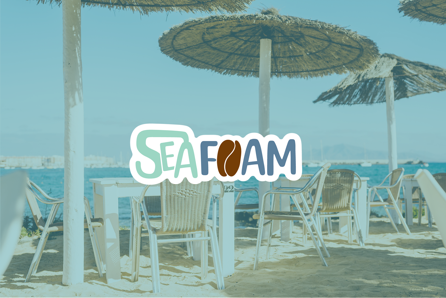
The Seafoam Coffee logo combines soft, rounded lettering with ocean-inspired colors to reflect the brand's relaxed coastal atmosphere. The coffee bean icon reinforces the café's specialty coffee focus, while the playful wordmark creates a friendly and approachable identity.
Brandmark Variations




Color Palette
Seafoam's color palette is inspired by the coast. Soft seafoam green and ocean blue bring freshness and calm, while sandy beige and rich coffee brown add warmth and grounding. Together, the hues reflect both the café's coastal roots and its inviting, cosy atmosphere.
Typography
Poppins was chosen for its circular forms that feel friendly and approachable, while its crisp structure ensures excellent readability across menus, packaging, and digital platforms. The font's versatility makes it a perfect fit for Seafoam, combining clarity with a contemporary coastal charm.
Doodles
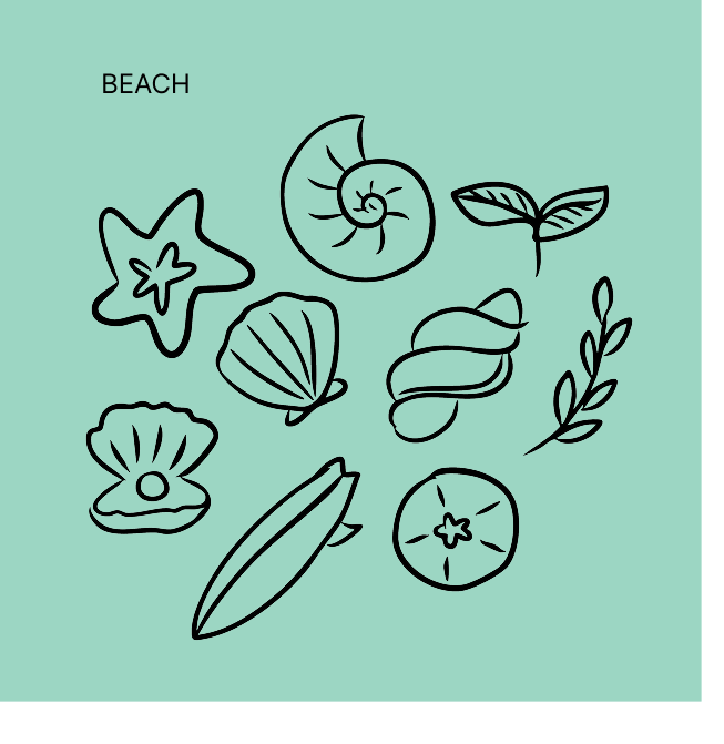
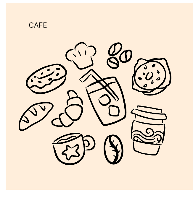
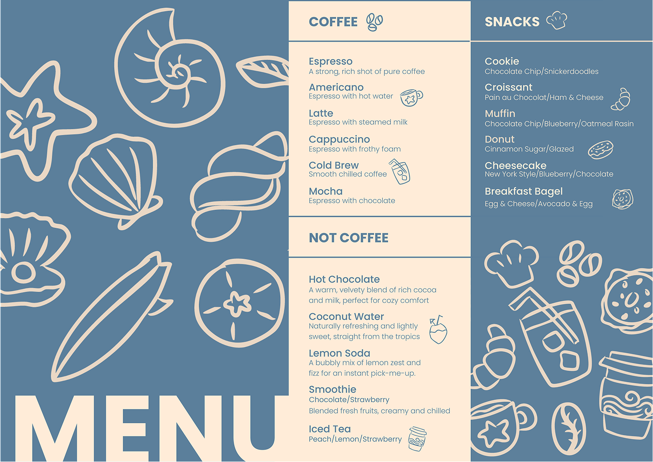
Hand-drawn doodles of shells, waves, and baked treats bring a playful balance of coast and café to the menu, adding warmth and personality to every detail.
Illustration
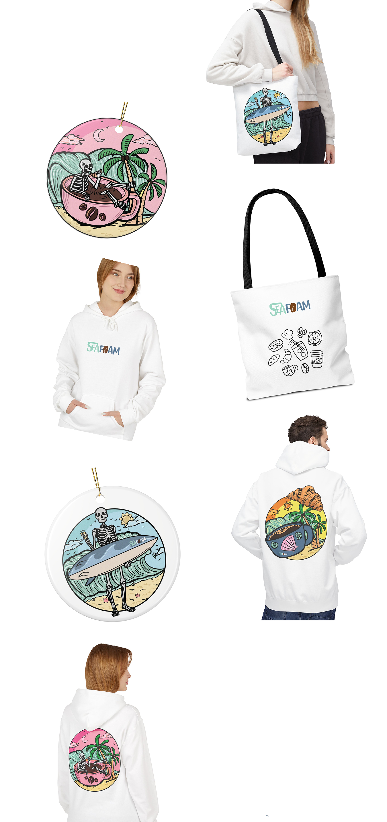
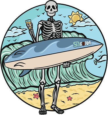
Seafoam's vibrant beach illustrations capture the café's playful soul. Inspired by surf culture and coastal life, the detailed circular artworks extend the brand into merchandise, trading card sets, and event materials.


Menu
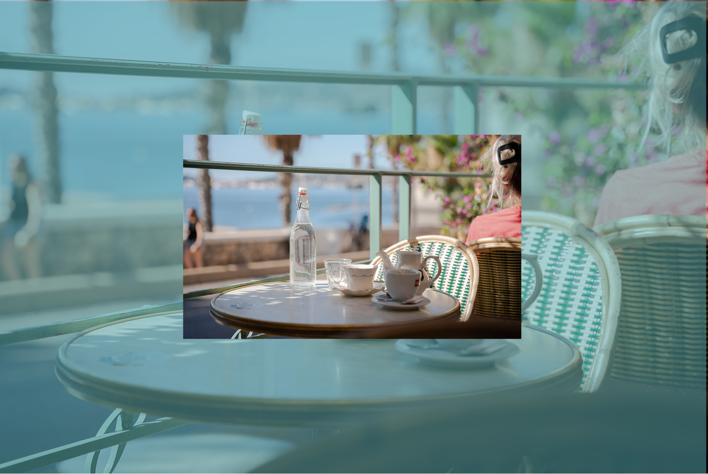
Seafoam's menu design reflects the café's breezy coastal vibe. Bakery and beach motifs flow across the layout, paired with a clean and approachable type system — a menu that feels light, inviting, and easy to explore, echoing the relaxed rhythm of life by the sea.
Mockups
From tote bags to apparel, every piece carries Seafoam's playful coastal identity into daily life, turning simple items into memorable brand experiences.