Primary Logo
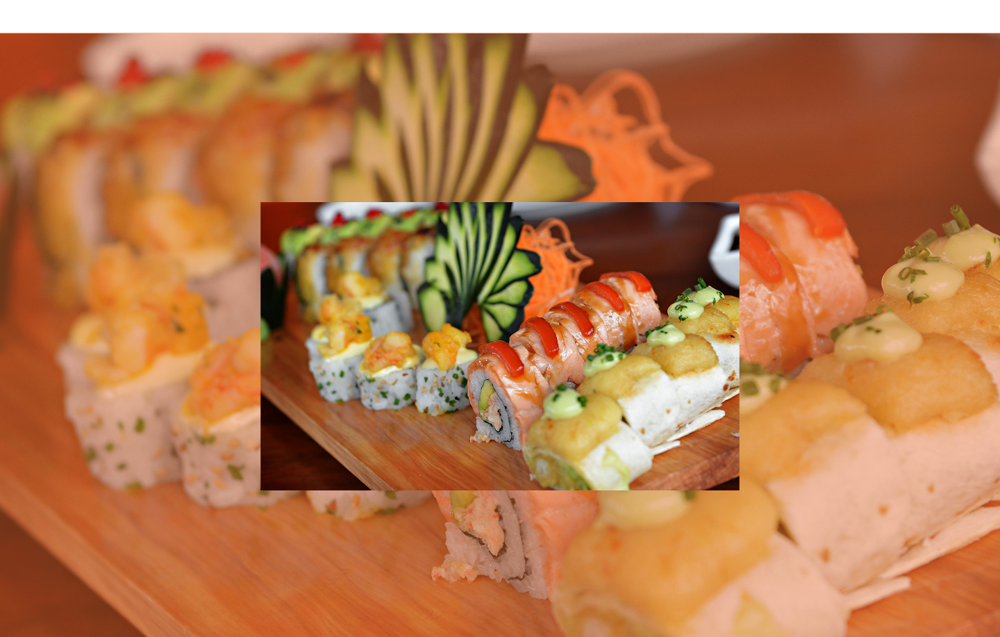
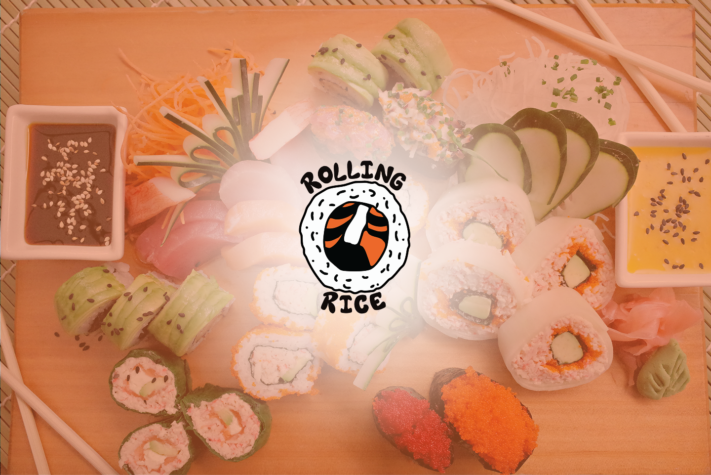
The logo features a bold sushi roll illustration with salmon and rice, highlighting the core product while also giving it a lively and friendly character. The rounded hand-drawn style conveys approachability and movement, tying in with the restaurant's name, Rolling Rice.
Logotype
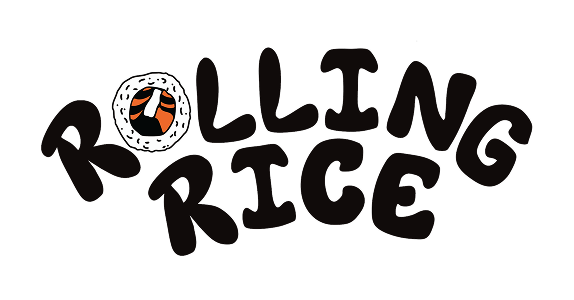
Brandmark

Color Palette
The colors are inspired by authentic sushi ingredients while keeping the palette bold yet minimal: Salmon Orange, Rice White, and Seaweed Black.
Typography
The brand uses rounded, approachable typefaces that echo the playful hand-drawn quality of the logo. Each weight plays a role: headlines feel bold and fun, body copy stays clean and legible, maintaining clarity across menus, packaging, and digital touchpoints.
Doodles
Illustrations
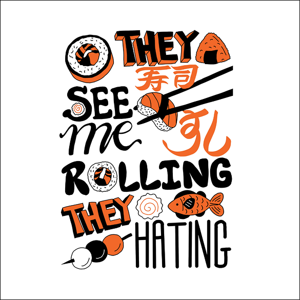
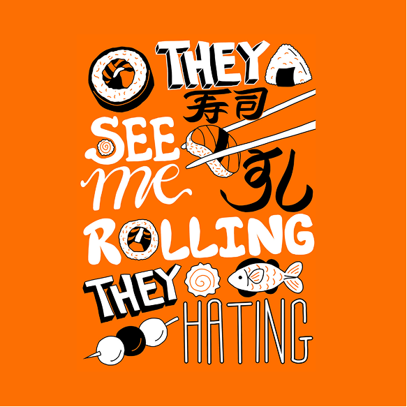
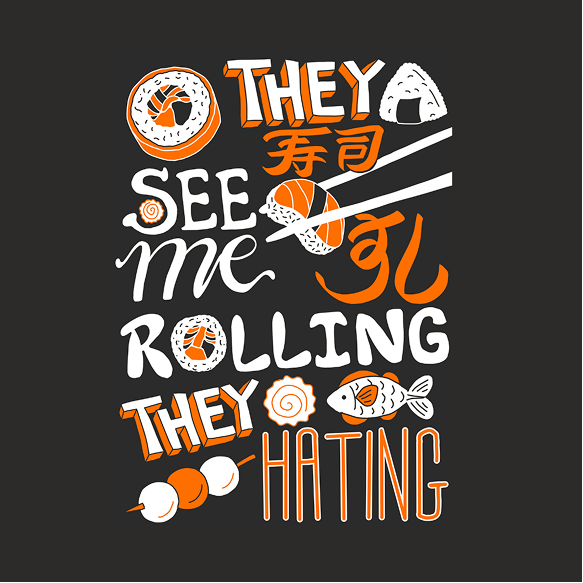
Detailed hand-drawn illustrations throughout the brand identity capture the spirit of sushi culture and street food energy. The illustrations are bold, noodle-packed, and coated in lively personality — used in store experiences, trading games, food booth materials, and product.
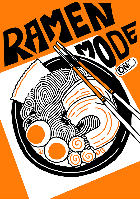
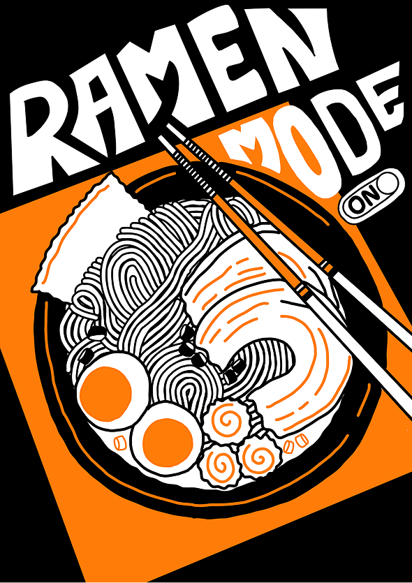
Ramen Mode On
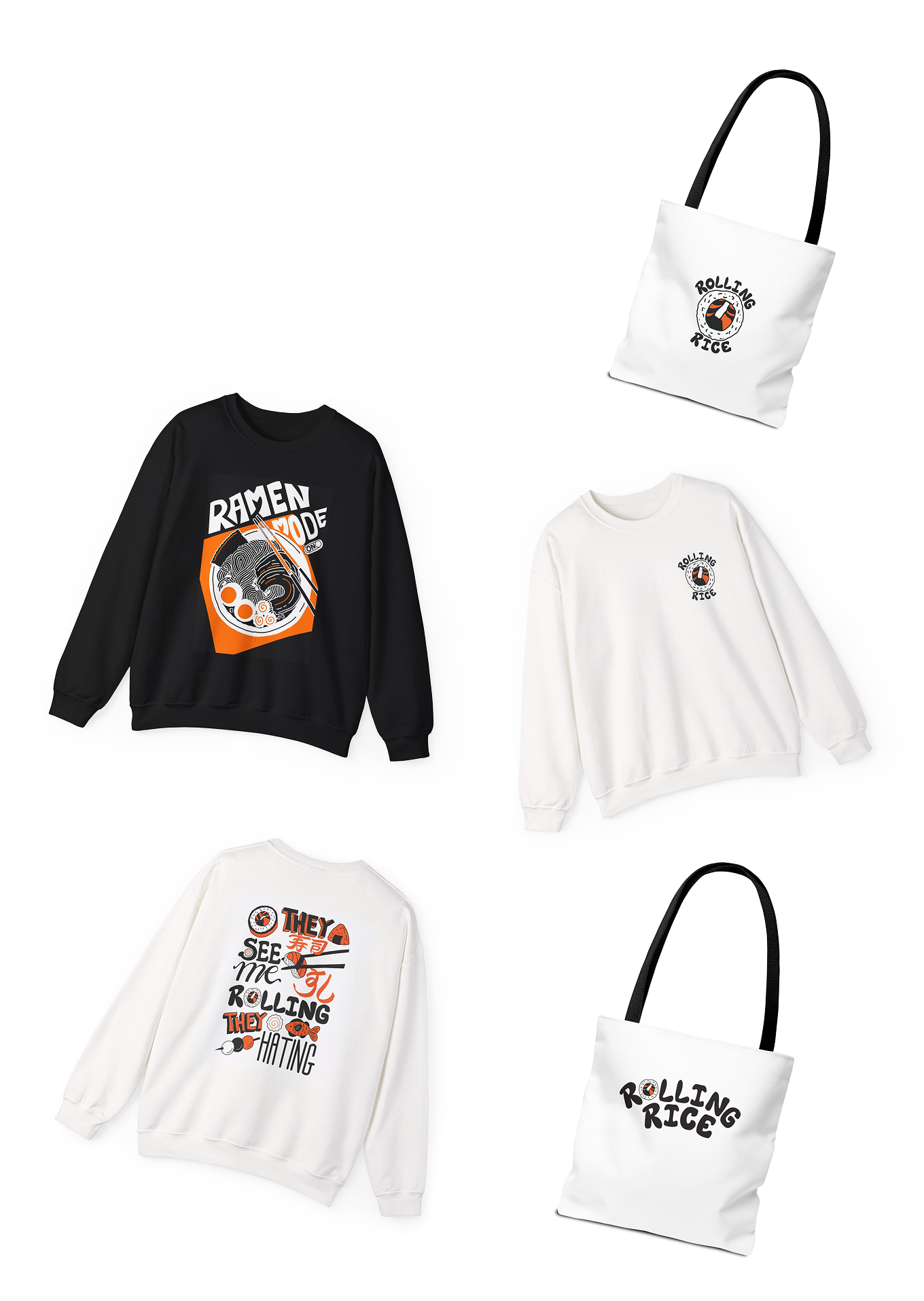
A steaming ramen bowl illustration with playful typography. Bold, graphic, and instantly recognisable — this piece captures the late-night ramen-craving energy that the brand loves to tap into.
Takeout Therapy
A quirky takeout box doodle with relatable text — because sometimes the best therapy comes in a cardboard box. This illustration brings levity and humour to the brand's print collateral.

Mockups
The Rolling Rice brand identity comes to life through playful everyday touchpoints: takeout packaging, tote bags and t-shirts that turn the brand into a lifestyle, and menus and signage that bold clarity with quirky accents. Each mockup reinforces the idea that Rolling Rice isn't just about sushi — it's about creating a joyful, memorable experience wherever the brand is seen.